
Duration
April 2025 – June 2025
Team
Product Manager - Meet Shah
Product Designer - Shreya Jindal
My Role
Research, User Flows, Product Strategy, Prototyping, User Testing
Objective 🎯
As part of improving lending experience, the objective was to design a clear and transparent loan journey that reduces confusion, improves trust, and enables easy repayment management.
Understanding the problem
To identify gaps in the existing loan and repayment experience, understand merchant pain points, and evaluate where confusion and drop-offs occurred across the journey.
Identifying gaps
The experience lacked transparency around repayment details, feedback on deductions, flexibility in repayment options, and clarity when managing multiple loans.
Defining the goal
To restructure the loan and repayment journey architecturally and visually, ensuring clarity, trust, and ease of use while supporting better conversion, retention, and long-term engagement.
Curent Flow
To set context, here’s an overview of the current lending flow and how merchants move through it today.
Approach to the Problem 🧠
We started by reviewing existing data, flows, and business inputs to understand where merchants struggled across the lending and repayment journey.
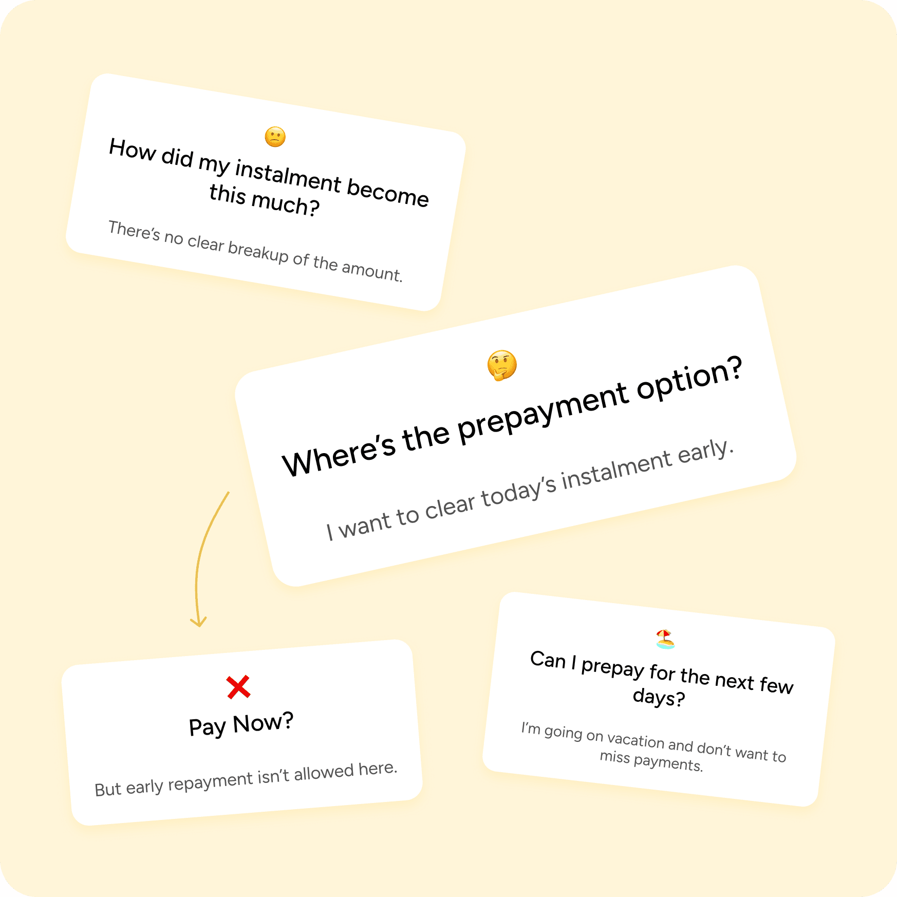
No Prepayment Option
Merchants could not make early or advance repayments, reducing flexibility and control over loan management.
Limited Visibility into Repayments
Key details such as repayment breakup, auto-deduction status, and previous deductions were not clearly visible, making it hard for merchants to track payments.
Edge Cases Were Not Handled
Scenarios like multiple active loans, partial payments, or loan settlement were not supported, leading to confusion in real-world usage.
Target Audience 👥

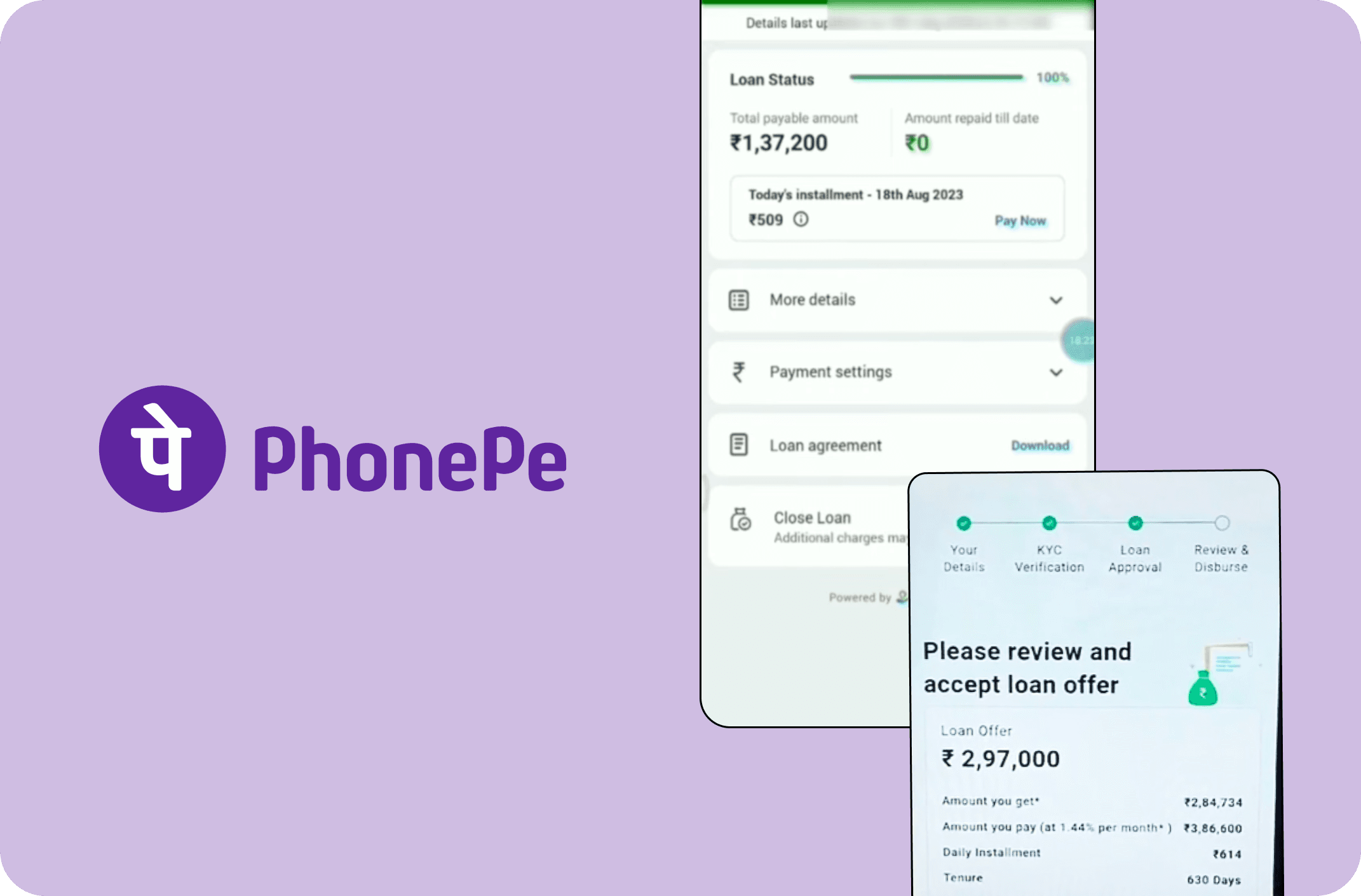
Competitive Analysis
To broaden our perspective, we reviewed similar lending and credit experiences in the market.
This analysis focused on how competitors handle eligibility messaging, repayment clarity, and user confidence. The intent was to understand what works, what feels confusing, and where we could differentiate while staying familiar to users.

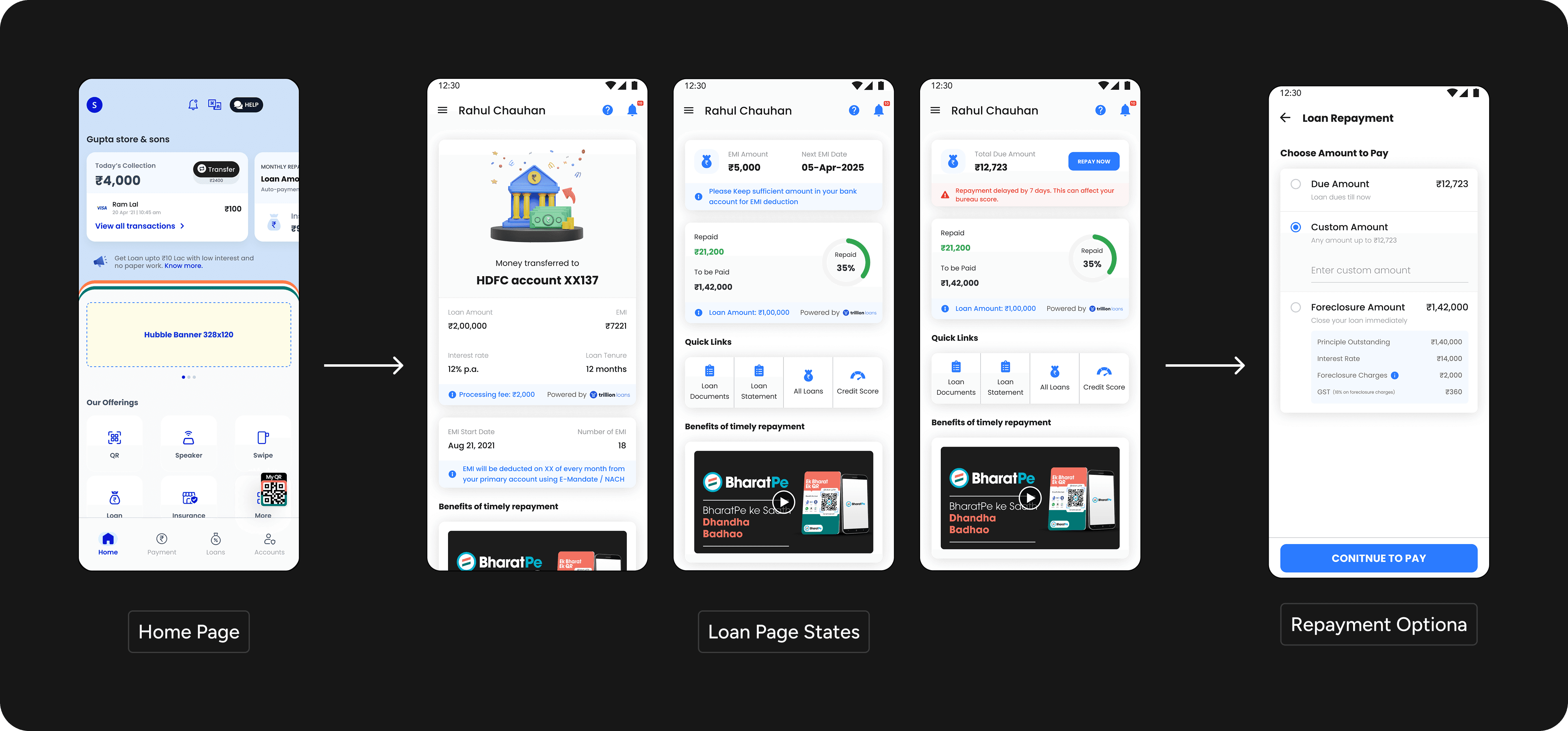
The MVP Flow
With insights in place, we aligned with stakeholders to define a lean MVP for the new lending flow.
The focus was to include only what was essential, clearly communicating loan details, setting the right expectations, and reducing ambiguity at every step.

Designed. Redesign. Repeat.
A lot of versions, tiny tweaks, big changes, and many “let’s try this again.”


User Testing 💡
After several internal iterations, we tested the new flow with merchants in real contexts.
These sessions helped validate our assumptions and revealed how clearly users understood the flow.

Financial language wasn’t intuitive
Merchants struggled to understand loan terminology and often misread similar values, leading to confusion about payments and status.
Information felt cluttered and unclear
Dense numbers, progress indicators, and weak visual cues made it hard to scan, understand, and take action confidently.
Users relied on automation
Merchants trusted auto-deductions and reminders, opening the app mainly when something felt unclear, highlighting the need for better reassurance and visibility.
The team began with certain assumptions about users, so advocating for user testing took time and alignment. Once we spoke to merchants, several new scenarios emerged that challenged the initial flow.
💪🏽
Final Designs
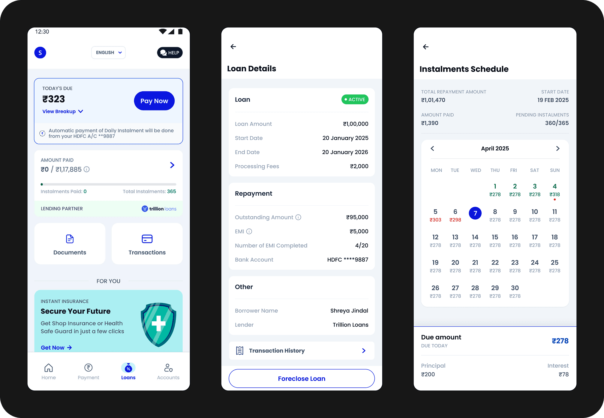
Clear Visibility at Every Step

Key repayment details such as total due, upcoming instalments, overdue amounts, and auto-deduction status are clearly surfaced. Merchants can now quickly understand what’s paid, what’s pending, and why.
Designed for Real-World Scenarios

As the project progressed, some use cases surfaced that we hadn’t planned for. Each new case pushed the design back to the drawing board, but it also helped me think more critically, and design with fewer assumptions.
💪🏽
Clear Repayment & History Tracking
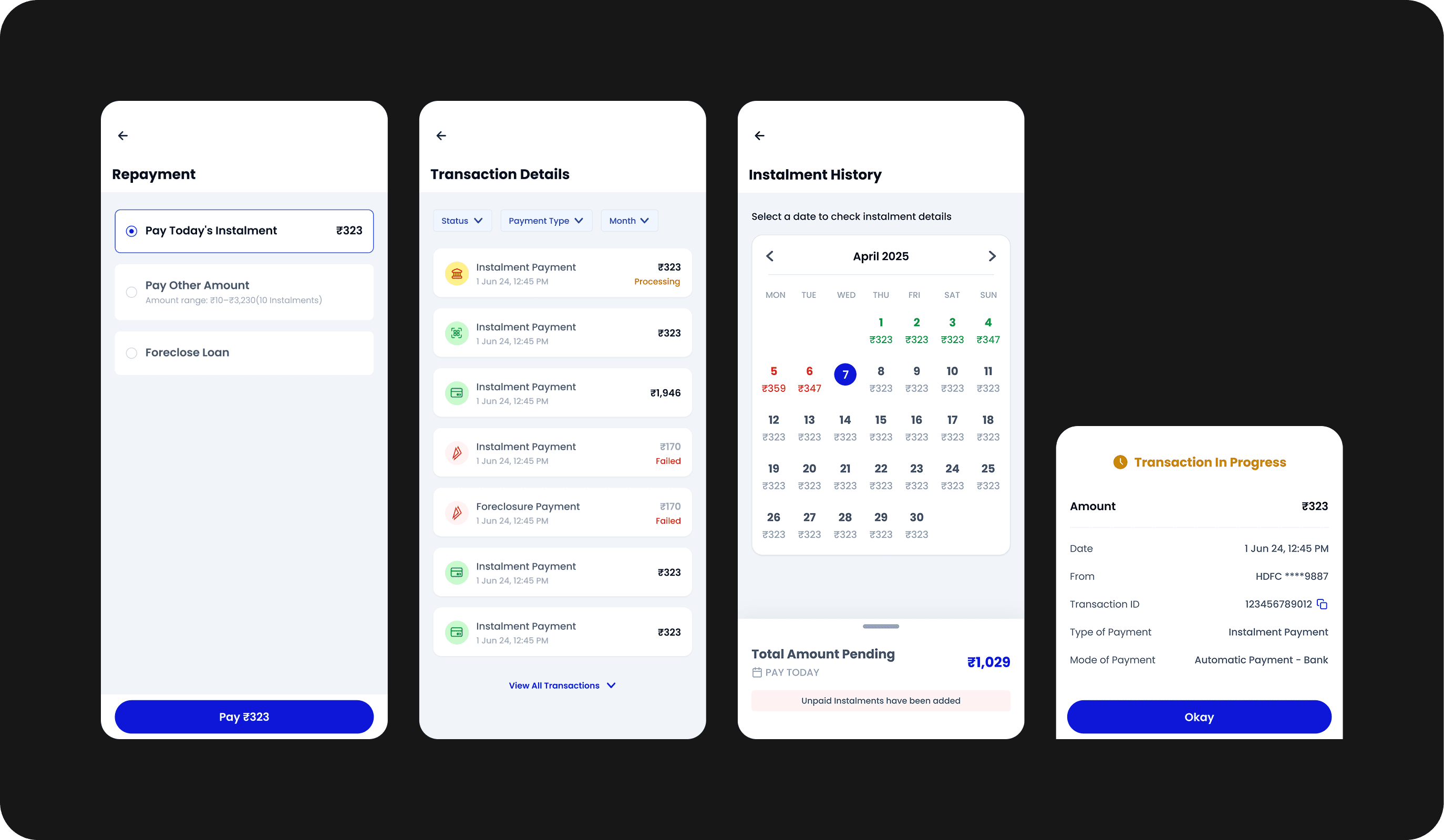
Repayment options are flexible and transparent, with clear access to instalment schedules and transaction history. Merchants can easily see past payments, upcoming dues, and auto-deductions in one place.
Impact 🚀
40%
~30%
Beyond the numbers, the redesigned experience helped merchants feel more in control of their loans. Clear breakdowns, better feedback, and flexible repayment options turned repayments from a point of anxiety into a manageable, everyday task.
Take a look at the next project!
